8 Key Components of Creating an Impactful Landing Page
A landing page is a standalone web page with a specific and narrow focus, designed to capture the attention of visitors and guide them towards a desired action. If you offer multiple products or services or target different customer segments, a landing page is the solution for you.
Building Landing Pages on Your Squarespace Website 📝
Adding focused landing pages to your Squarespace site is an effective way to drive campaign traffic, conduct A/B testing, reach different audiences, and increase conversions.
To create a landing page on Squarespace:
Go to your settings panel and add a new unlinked page.
Landing pages typically hide the site navigation for a clear focus.
Custom CSS and HTML can be used to hide navigation if desired.
Squarespace makes it easy to build landing pages by allowing you to duplicate pages and use saved sections to quickly build landing pages with all the key components.
To create an engaging and persuasive landing page, consider incorporating these key components:
1. Unique Value Proposition 💎
Clearly express what makes your business unique, showcasing the value you offer compared to competitors. Let your visitors know why they should choose you.
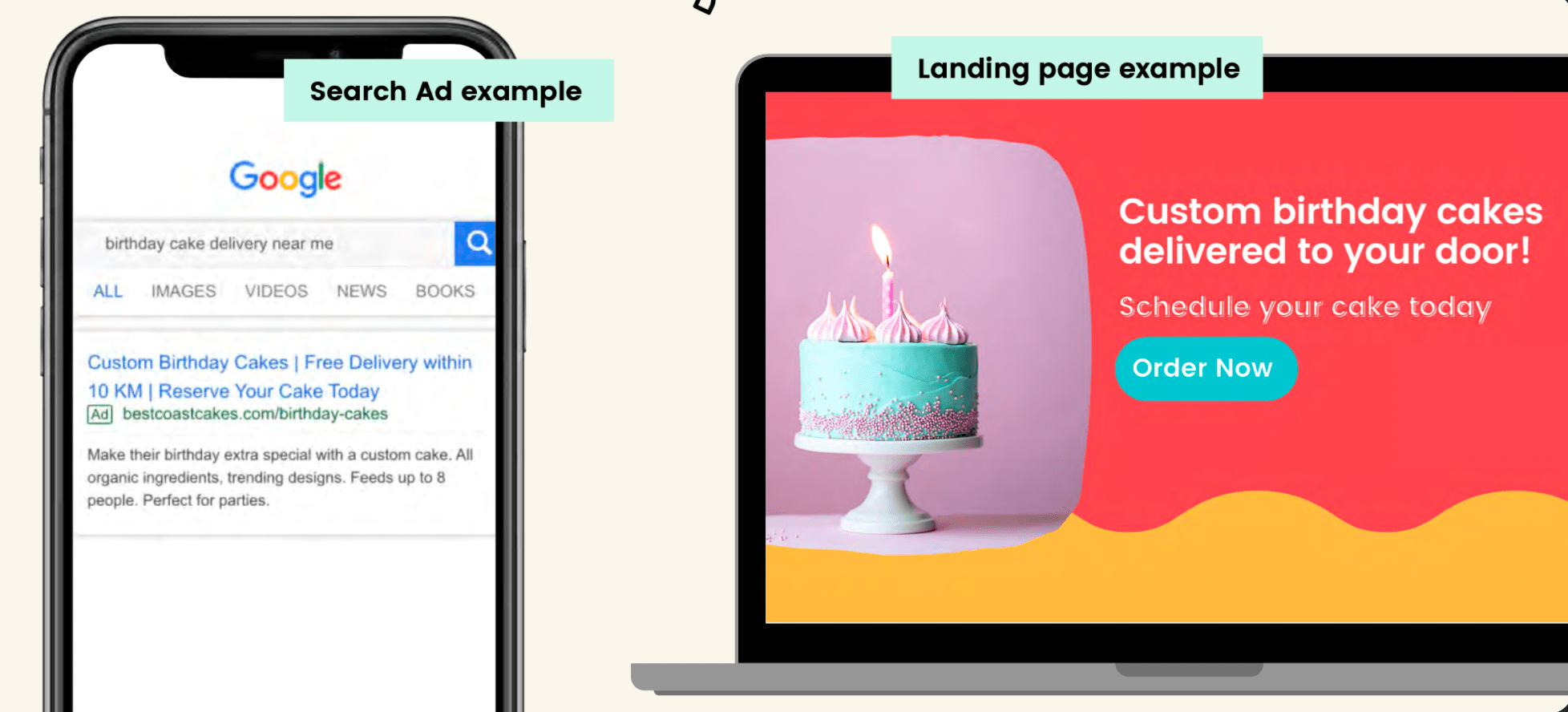
For example, a bakery selling all sorts of wonderful baked goods is now selling custom cakes. Rather than sending paid ads to their homepage and leaving people sorting through scones, and donuts, they have created a custom landing page dedicated only to their specialty cakes. They are also running search ads, where their ads only appear if people are looking up custom cakes in their area.
The bakery can use a clear and compelling heading to establish themselves as the top choice:
"Delicious Award Winning Custom Cakes – Vegan, Gluten Free, and Delivered to Your Doorstep"
2. Features & Benefits 🌟
Highlight the distinctive features and benefits of your product or service to demonstrate its value. Show how it can solve your customers' problems or make their lives better.
Expanding on our bakery example, the cake shop will want to add details about their key features and benefits:
“Welcome to our custom cake shop, where we specialize in creating delicious cakes tailored just for you! We are happy to offer free delivery, vegan and gluten-free options, and the ability to customize your cake with a variety of stunning decorations. Let us make your cake dreams come true!”
To improve clarity and readability, the bakery might opt to use bullet points or icons to illustrate their features.
Delicious cakes tailored just for you
Free delivery on all orders
Vegan and gluten-free options available
Proudly awarded "Baker of the Year 2022"
Customize your cake with stunning decorations
3.Testimonials & Social Proof 👥
Boost trust and credibility by incorporating testimonials, reviews, or social proof. Sharing positive experiences from satisfied customers will showcase your reliability.
Expanding on the bakery example, the landing page should include high quality images of beautifully decorated clients and reviews from happy customers.
4. Attention Grabbing Hero Image 🖼️
Grab attention with an eye-catching hero image that visually represents your offering. Use a compelling visual that sparks curiosity and draws visitors' focus.
5. Clear Call to Action 📣
Guide visitors to take action with a prominent and persuasive call-to-action button. Ensure it is compelling and stands out, encouraging them to engage further.
A strong call to action compels users to take immediate action and engages them with a sense of urgency and purpose.
Call to Action Best Practices:
Use action-oriented language: Phrase your call to action in a way that prompts users to act, such as "Shop now," "Join Waitlist," or “Order Now”
Make it visually prominent: Use contrasting colours, larger fonts, or buttons to draw attention to your call to action so it stands out on the page.
Keep it concise: Use brief and clear messaging to make it easy for users to understand what action they need to take.
Offer value or incentives: Provide users with a reason to take action by highlighting benefits, discounts, free trials, or special offers.
Place it strategically: Position your call to action prominently on the page, either above the fold or in a location where it is easily accessible and visible.
Provide a seamless experience: Ensure that clicking on the call to action leads users directly to the action requested, whether it's a sign-up form, purchase page, or download link.
6. Lead Capture Form 📝
Design a concise and effective lead capture form to collect important visitor information, such as email addresses or allow people to contact you regarding services. If you are using a lead capture form, make sure it is aligned with your larger campaign objectives and avoid unnecessary fields.
7. Consistent Creative & Messaging 🎨
Maintain consistency between your landing page, your campaign and overall branding to avoid a disjointed and confusing experience.
Having a cohesive branding and messaging across ads and landing pages ensures a seamless and consistent experience for the audience, building trust and credibility, and helps drive conversions.
8. Clear Messaging & Relevance 🔍
Creating landing pages with clear messaging is crucial for ensuring that visitors fully understand the purpose of your website and what action you want them to take. By aligning the messaging on your landing page with the intent of your marketing campaign, you can maximize engagement and conversion rates, leading to a more successful online presence.


Integrating these components into your landing page will help captivate your audience, establish trust, and increase the likelihood of conversion. Remember to keep the content engaging, concise, and visually appealing throughout. Best of luck, and 🙌 happy optimizing your landing page!
