
2026 Web Design Trends | Seeking Proof of Life
Hi there, I’m Britt, a Squarespace web designer and marketing strategist who is constantly looking for web design inspiration. Design trends come and go, but as we move into the era of AI, I can’t help but see that the shifts feel more dramatic, and in some ways philosophical. Web design is becoming less about cool new features or a trending aesthetic, and more about what kind of world we want to live in, what we want from technology and how we are balancing AI with human centred design. The following explores my observations on the top web design trends for 2026.
If there's one thread I think we'll find weaving through nearly every web design trend in 2026, it isn't a new tool (yes I am fully aware of AI), a colour palette, or a typography reset. It is a collective ache.
People are searching for proof of life. They want to see work and craft that feels like a human was behind it. And more than that, they want to feel something. They are looking for something different than what marketing and tech have become so synonymous with lately -monetization disguised as value, and rage bait dressed up as content. They are looking for something that feels warm and familiar, but novel and exciting in its own way.
Technology keeps accelerating and workflows keep getting faster, but the visual language I see emerging in 2026 is pushing back. Not against progress, but against a particular kind of sterility and frictionless perfection.
Web Design Trends 2026 Chapters:
More feeling, more presence
Yes, the '90s and Y2K nostalgia wave continues. But I think something more interesting is happening beneath the surface of that trend cycle. Gen Z's pull toward older visual languages was never purely about aesthetics. It's about constructing, even symbolically, a version of a world that feels more present. Every generation recycles trends, but what I think we're seeing now runs deeper than a cycle. It's more of a collective yearning. Seeking something more analogue and tangible isn't just nostalgic, it is both a grieving and a craving for a world where your phone can’t fracture your presence at any moment.
Whether it's Gen Z joining running clubs or older millennials and Gen X jumping on the sauna craze, this is popping up everywhere. And while optimization culture overlaps heavily in the Venn diagram here, often rooted in a desire for control in a quickly changing world, there is also something simpler happening. People are seeking an anchor while everything spins faster and faster around them.
People are beginning to feel the accumulated weight of what a decade of doom-scrolling extracted from them, and they want something to show for their attention. They want to feel something. They're getting more cerebral, more discerning, more willing to slow down for something that earns it. That doesn't mean usability goes out the window, but it does mean design in 2026 is less about removing friction and more about creating genuine feeling.
As we move into the future, there's a growing trend of looking to the past for inspiration. Websites are increasingly incorporating vintage aesthetics but with a modern, playful twist that keeps the design fresh and engaging.
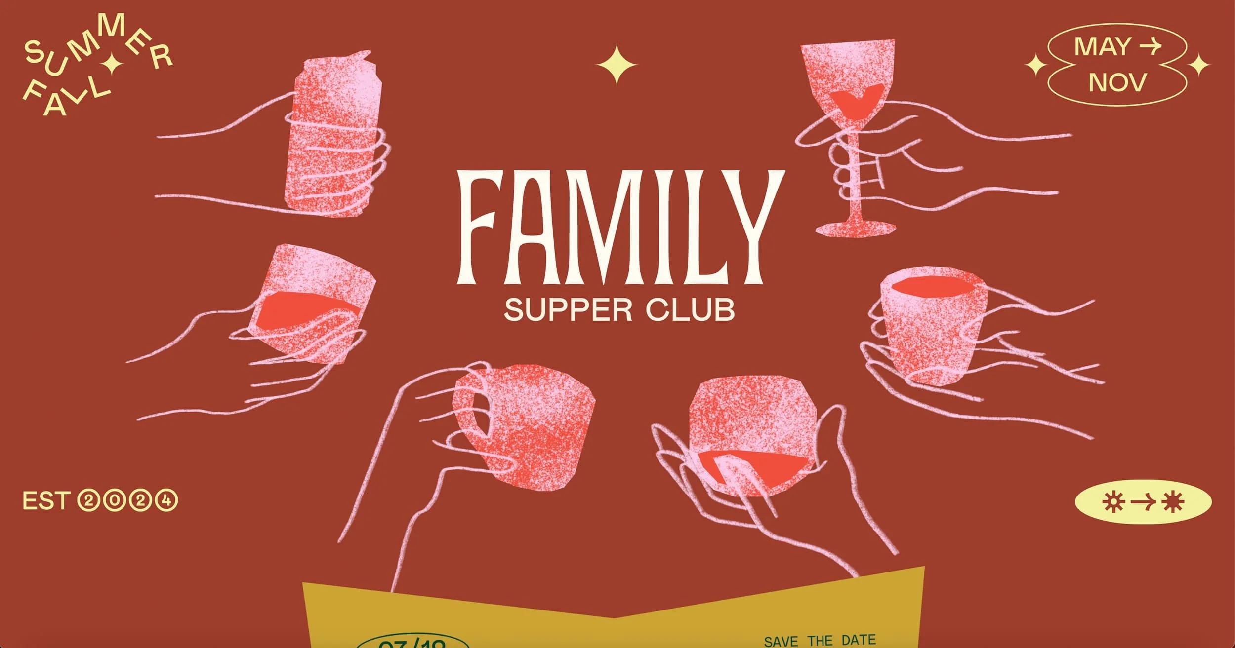
Family Supper Club is a perfect example of this trend. The website features retro-inspired typography and colour schemes that evoke a sense of nostalgia, but the overall design feels contemporary and fun.
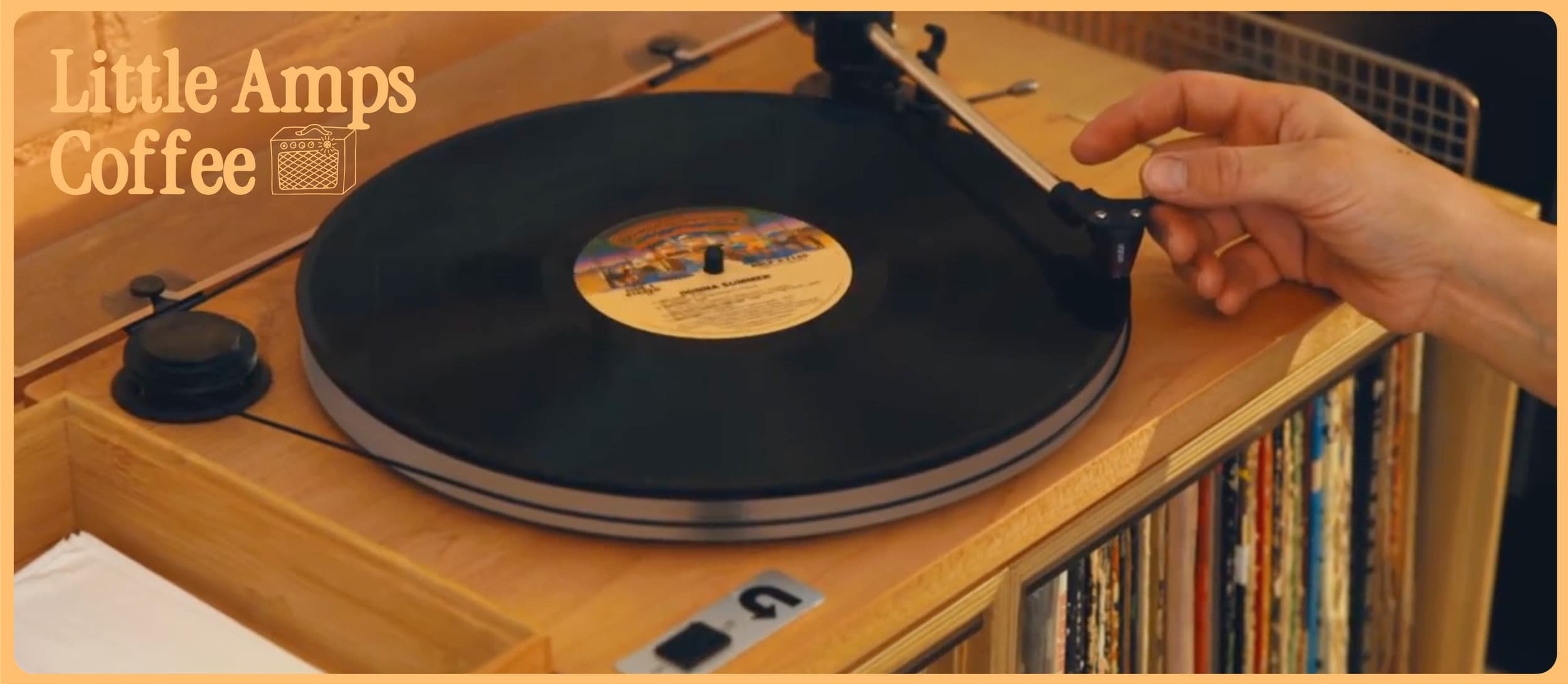
The same can be said for the Little Amps Coffee website, sprinkling in warm hues, retro fonts and playful graphics.
I personally love the example below, from Woset World. I think this is a brilliant, fun and creative website and a great approach to standing out in a saturated market and delivering memorable design.
Tactile Digital Experiences: Bringing Texture to the Screen
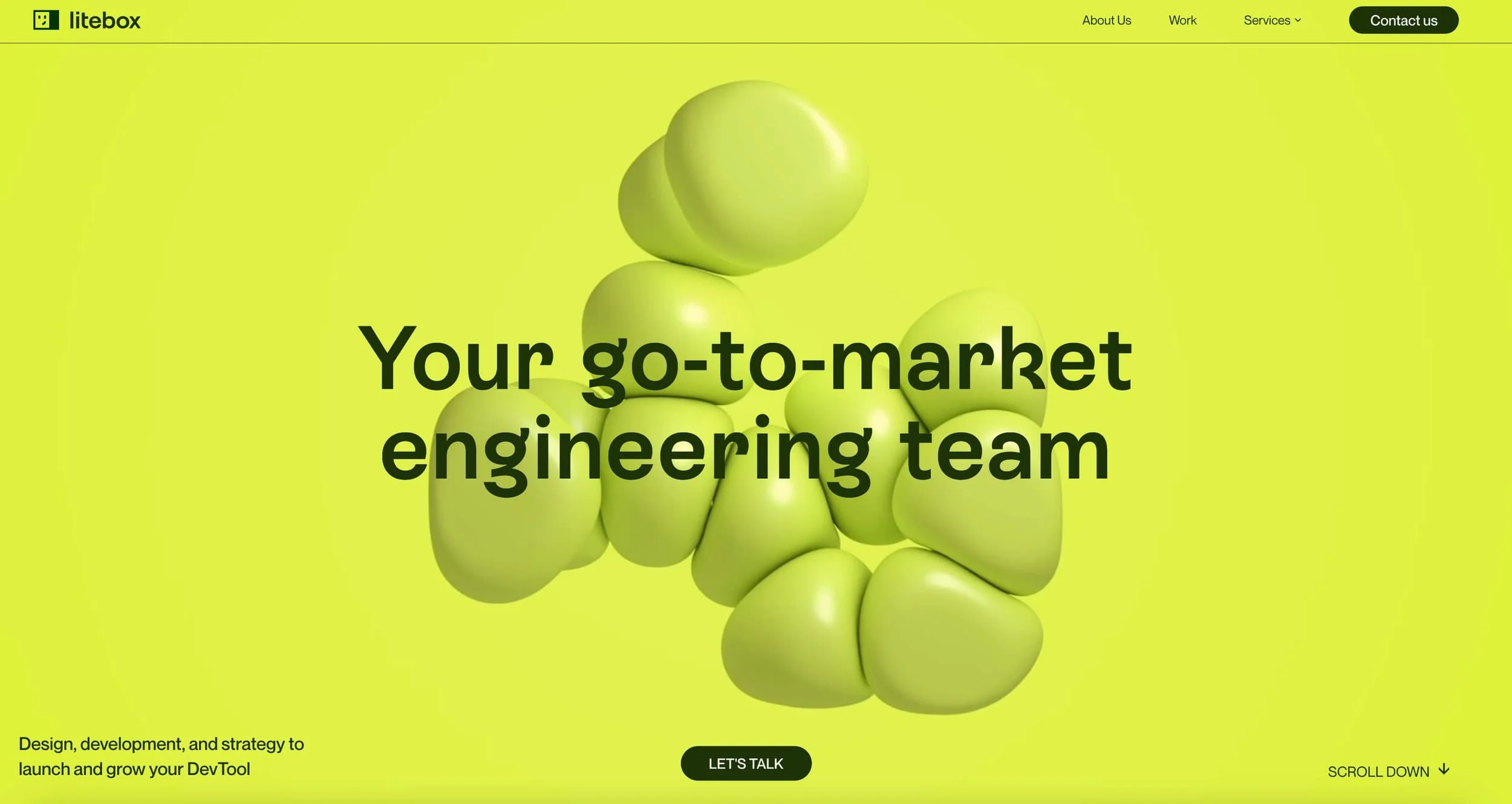
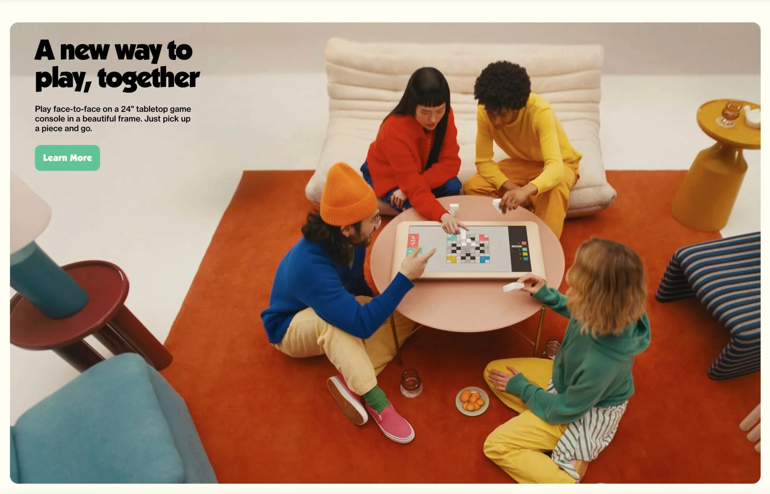
As digital experiences become increasingly sophisticated and templated design becomes even more accessible, designers are finding ways to make websites feel more tactile, three-dimensional and unique. This trend involves incorporating elements that appear squishy, fuzzy, plush, or balloon-like, adding a sense of depth, interactivity and playfulness to web design.
Wanna This offers a collection of abstract 3D shapes that exemplify this trend. This is a great place to start if you are looking to create a more memorable website experience and lends well to breaking the traditional grid, layering imagery, and experimenting with layouts.
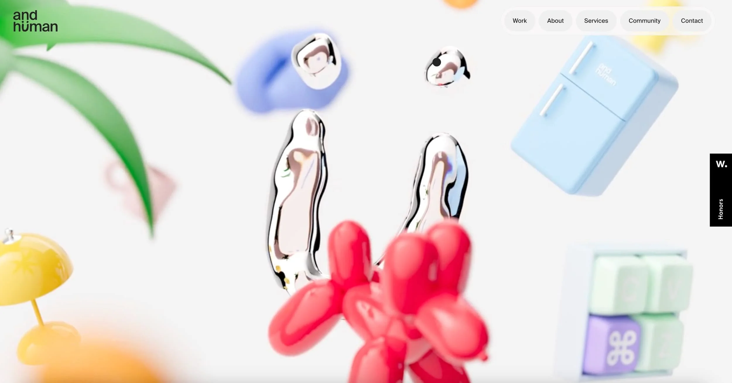
Source: and human
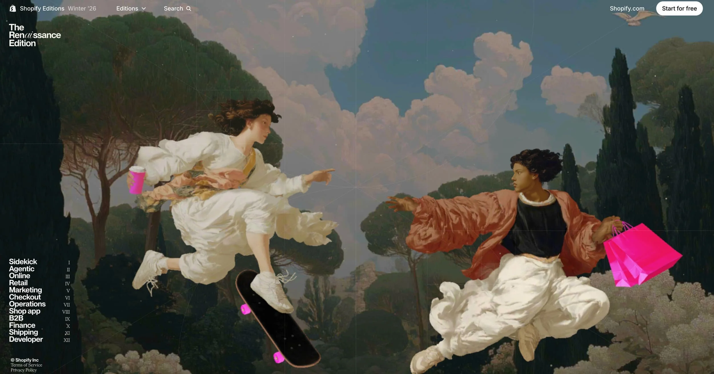
Colliding Timelines
Shopify named their Winter 2026 product release the RenAIssance Edition. A platform announcing new AI features, leaning into a period known for art and pushing human potential. The landing page playfully incorporates renaissance figures skateboarding and working on modern day computers. It makes sense that this visual language is showing up here as it folds technology into the promise of human creativity.
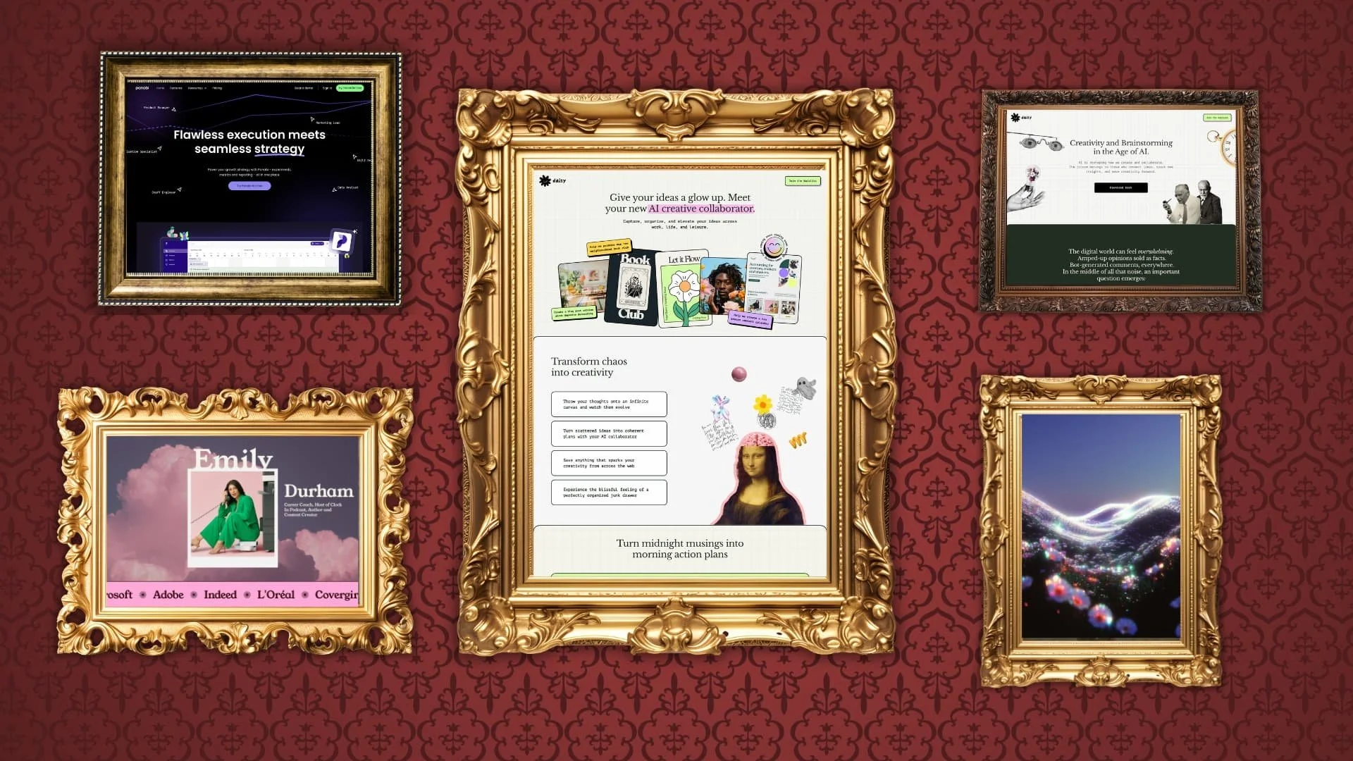
Museum design inspiration for website portfolio
Scrollytelling: Crafting compelling narratives
In an era where AI-generated content is becoming increasingly prevalent, the ability to create a compelling narrative is more crucial than ever. Enter scrollytelling, a technique that combines scrolling with storytelling to create rich, engaging user experiences.
A prime example of effective scrollytelling is the website for HPQ Frankfurt. As users scroll down the page, they're taken on a journey through the company's history, values, and services. This approach keeps users engaged and curious about what comes next. This is especially effective for items like real estate or products with a higher price tag. Leaning into scrollytelling is a great way to showcase your benefits and value without boring people with walls of text and technical jargon.
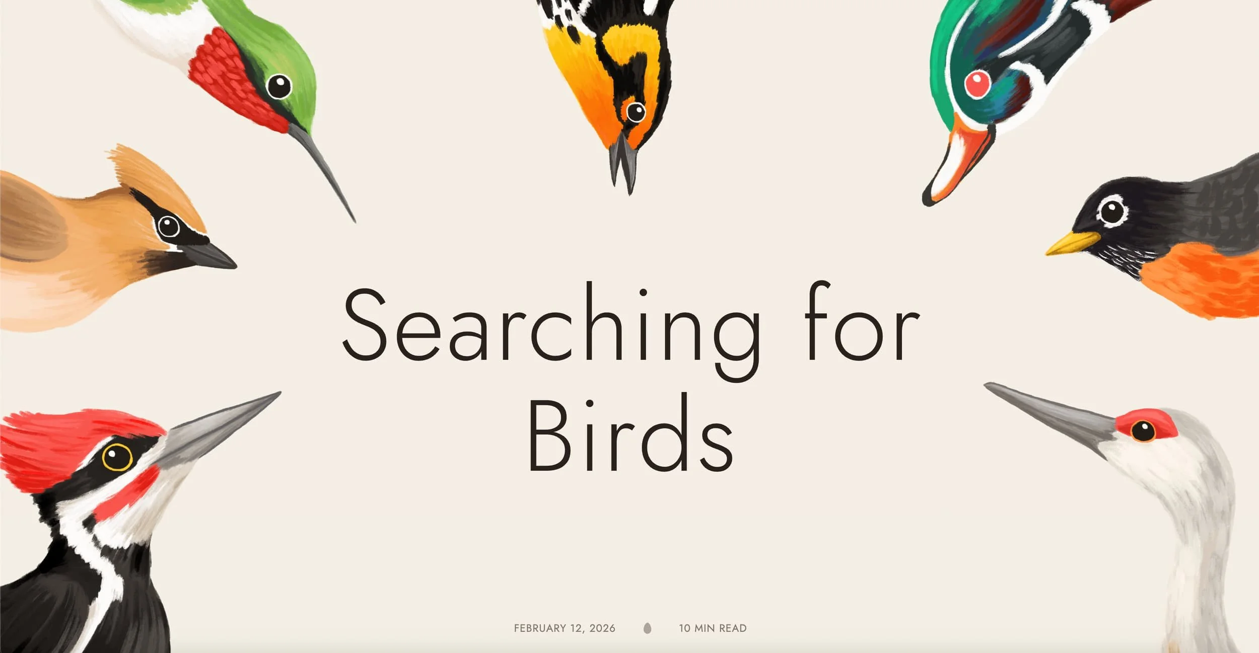
In my experience, scrollytelling is a great way to take longer from educational or research-based content and turn it into something engaging. Fundraising and public health campaigns can also greatly benefit from scrollytelling as people often need to learn about a cause and feel invested before they are ready to take action.
For one of the strongest examples of educational scrollytelling I’ve come across lately visit “Searching for Birds”
Scrollytelling allows businesses to:
Break down complex information into digestible chunks
Guide users through a narrative in a controlled, sequential manner
Incorporate interactive elements that respond to user scrolling
Create memorable, shareable experiences that stand out from the competition
Mid-century design as a serious reference point
Earthy warmth, the restraint of 1950s and '60s graphic design. The appeal of mid-century design goes beyond nostalgia, or the fact that it just looks really great. It's about what those aesthetics signal - craft, intention, and permanence.
In a world where anything can be generated in seconds and nothing needs to be deliberate, that signal is increasingly rare.
There's something telling about the fact that mid-century design resurfaces so reliably in tech. Technology, more than any other industry, moves quickly. Companies pivot. The very nature of the industry works against the idea of permanence. So when a tech brand reaches for the visual language of an era defined by craftsmanship and longevity, it's doing something deliberate. In this new world, where anything can be generated in seconds and “vibe coding” is part of our lexicon, that kind of signal is increasingly rare.
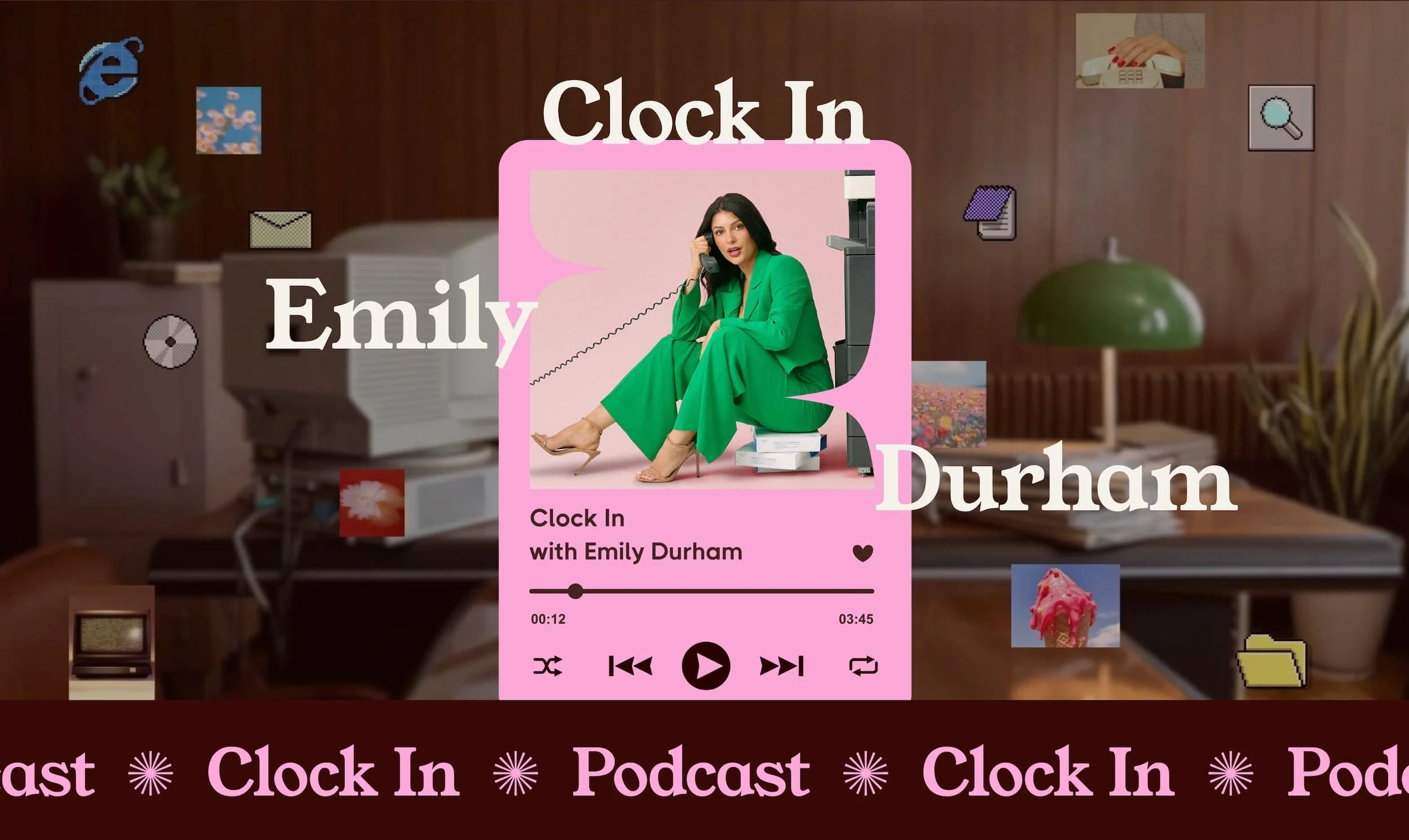
The example below is one of my recent Squarespace website examples for content creator, podcast host and author Emily Durham. It blends mid century vibes with playful y2k elements and combines retro colours with playful pinks and purples.
Header video sections are back, but better
Video has become an increasingly powerful tool for web design, allowing businesses to showcase their products and immerse visitors in unique experiences. This is certainly not a new trend, but an improved one. Today, bandwidth capabilities have improved and video editing tools are more and more accessible. Gone are the days of grainy pixelated videos slowing down your website. Now, without a lot of expense or effort people can stitch together an impactful video that really showcases what makes them special.
One standout example of this trend is the surf travel site Thermal. The website immediately captivates visitors with a full-screen video background featuring stunning footage of surfers riding waves in beautiful locations. This approach not only showcases the product (surf travel experiences) but also instantly transports the viewer to these dream destinations.
As we move forward in 2026, expect to see more websites utilizing video in web design and across social channels in creative ways, such as:
Interactive video backgrounds
Video based tutorials
Behind-the-scenes glimpses into company culture
Customer testimonials and success stories
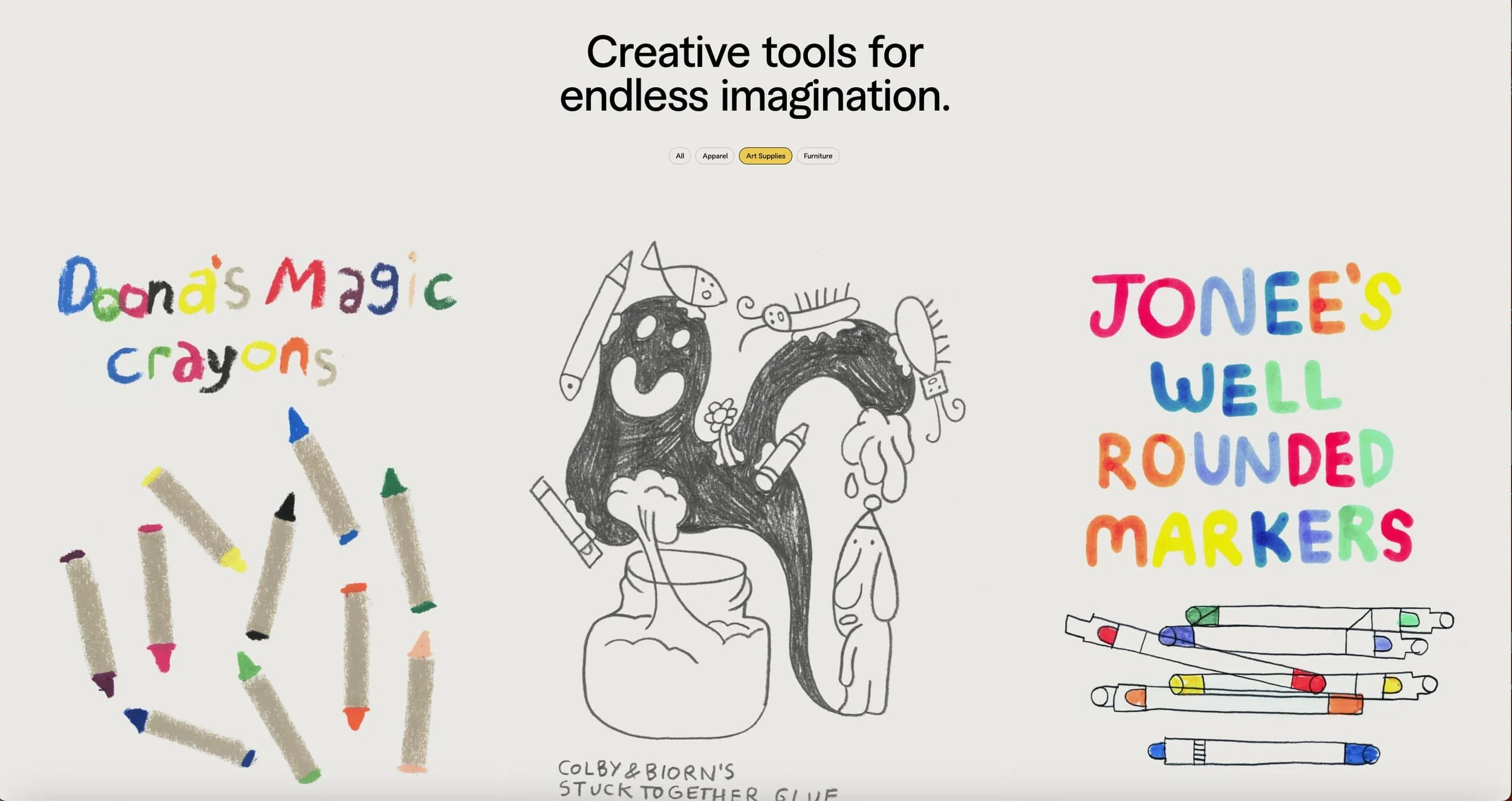
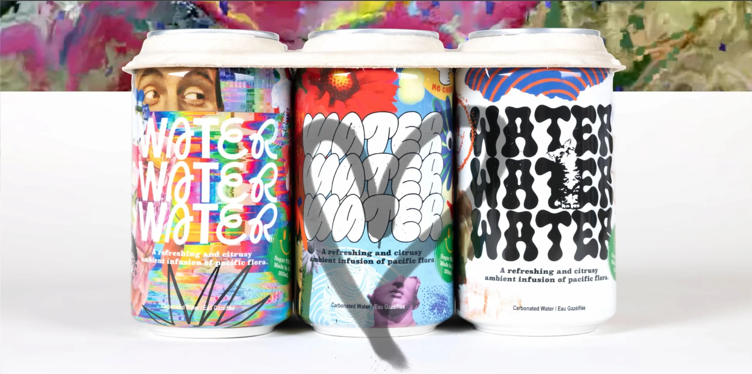
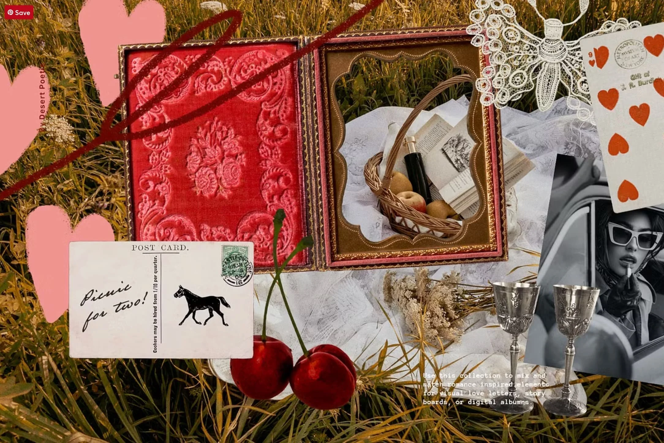
Notebooks, collectibles and doodles
There is something happening beyond the tactile 3D shapes I mentioned earlier. A different but related theme, joyful little trinkets and collectibles. The object that exists purely because someone thought it was delightful.
Grid paper, gummy bears, playing cards, lockets, dominoes, seashells. These are the things you find at the bottom of a bag, or the corner of a desk drawer. They don’t necessarily carry a particular function but they tend to make people feel something. They are playful and recognizable and a little random while being somewhat personal and even nostalgic.
The aesthetic territory of 2026 web design sits at an intentional intersection: advancing technology on one axis, the human and the tangible on the other. Neither cancels out the other. The tension between them is kinda the point.
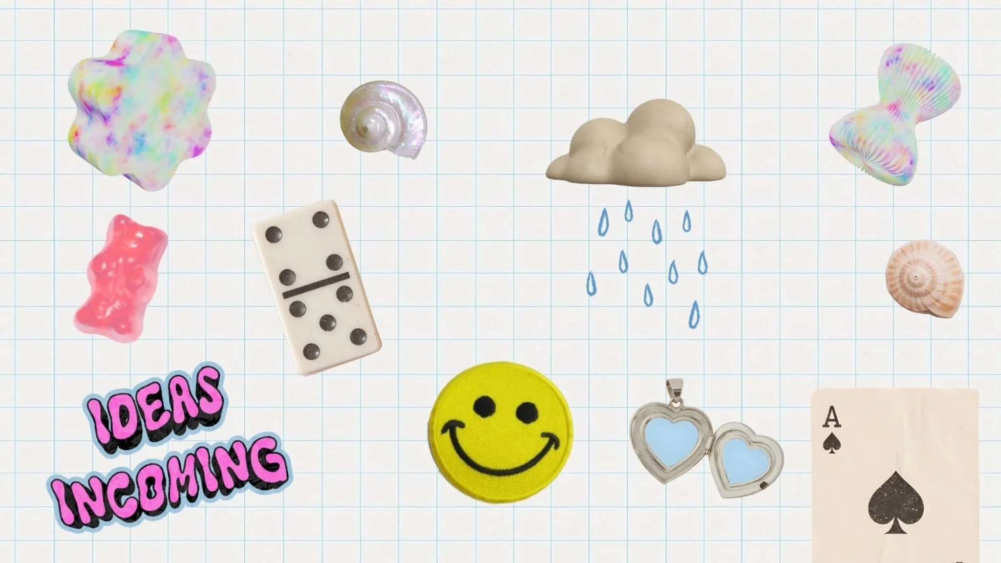
And then there are the doodles. Not the clean, friendly illustrations that became the visual shorthand of every tech startup in the 2010s. What's emerging now is a bit quirkier, a bit wobbly, and imperfect in ways that feel intentional.
Value propositions are changing
Speed is becoming the baseline. Some of the most compelling brands are leaning into empathetic statements and highlighting what makes people uniquely human. That isn’t to say you can’t highlight efficiency or time saving, but you need to anchor it in something more substantial. Even for tech companies this will be more about bringing an idea to life than it will be about doing something quickly.
Yes doing something quickly is important and somewhat exciting, but bringing your idea to life is a much stronger and stickier promise. For the next couple of months I think we will see people claiming “speed and efficiency” but as time goes on and speed is the new expectation, people will need something sturdier to grab ahold of.
This is also a useful reminder about what AI can and can't do for you right now. It can help you spin up a website in minutes. It cannot tell you what your audience is actually trying to achieve. Simply generating keyword-rich content and calling it a strategy won't cut through, because your audience is searching for more than a product. They're searching for an outcome. An emotion. A version of their life that feels a little more like what they wanted.
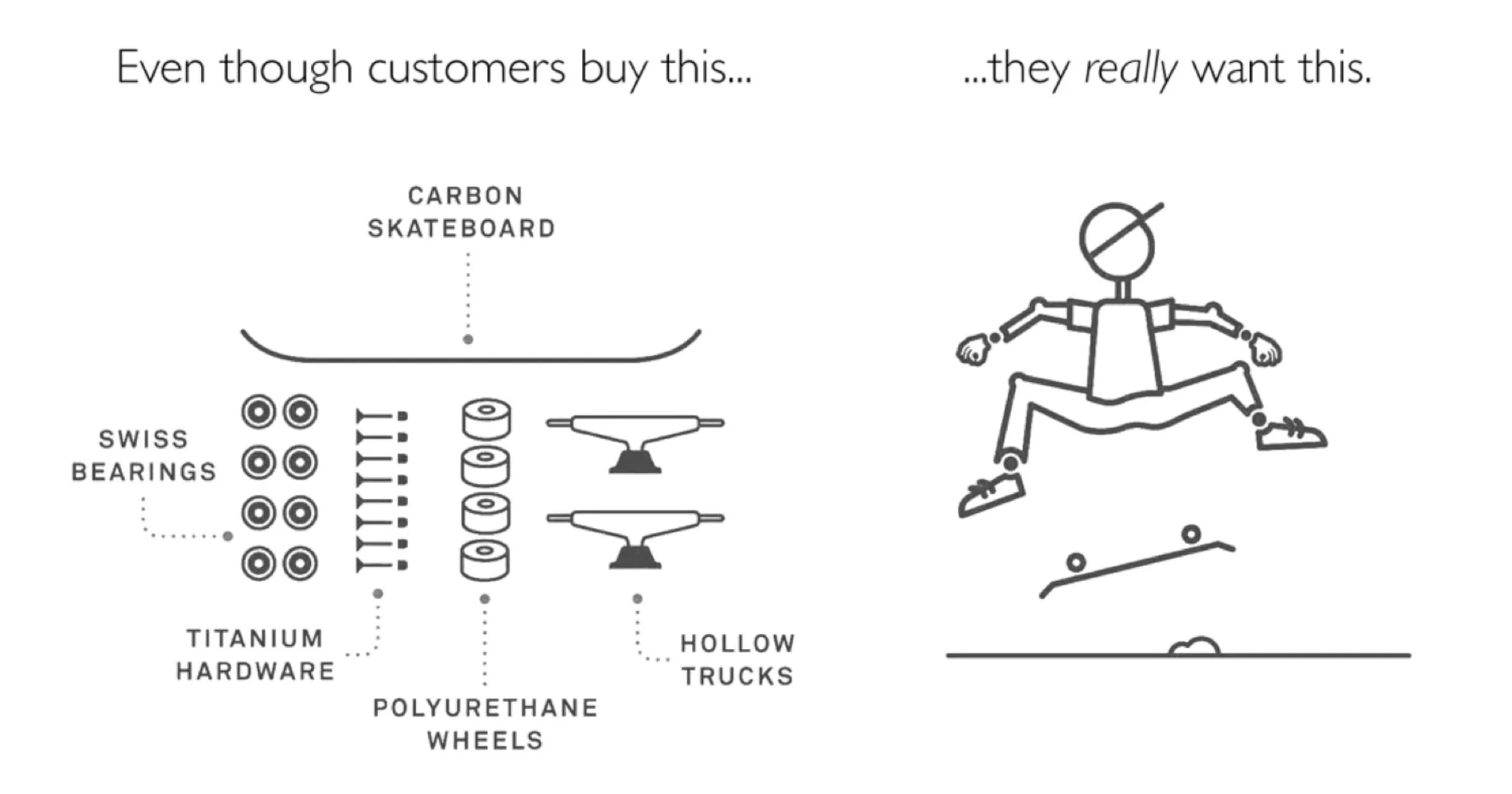
The brands getting this right understand that design can open the door, but messaging is what makes someone feel seen. The Jobs to Be Done framework is a great way to think through this in this brilliant graphic below. At its heart, JTBD challenges us to look beyond surface-level product features and dig deeper into the true motivations driving consumer choices. It prompts us to ask: What are people really "hiring" our product, service, or even our blog article, or tutorial to do for them?
For a worksheet to help you with this, check out my “Communicating Your Why” worksheet.
Nature as texture
Stone, linen, wood grain, the imperfect surface of handmade paper . There's a rising wave of organic shapes and textures in web design that represents a departure from the sleek and geometric.
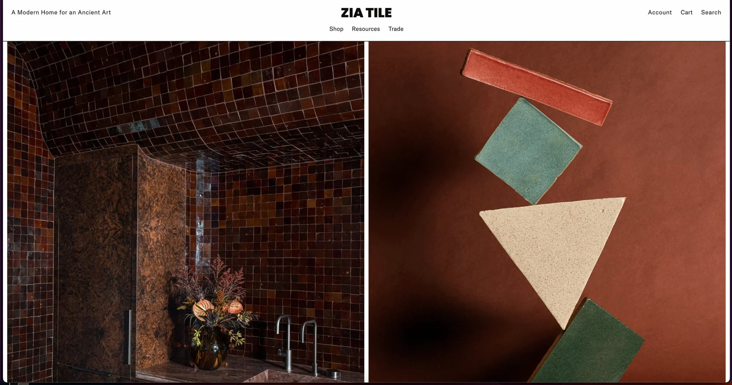
Zia Tile illustrates this really nicely. Rather than filling the page with aspirational lifestyle shots of beautiful homes, they make a more confident choice: show the tile, up close, large, and immersive highlightihng the the slight irregularity of handmade edges.
Colours are part of this story too. The palettes gaining the most traction right now combine earthy, grounding hues with unexpected neon accents. Graza, an olive oil company does this brilliantly, grounding, comforting greens and beiges accented with brighter, contrasting pops that feel modern without abandoning warmth. It resonates with their key demographic (environmentally conscious, younger consumers) without being heavy-handed about it.
It's worth noting: green is to Gen Z what pink was to millennials. Immediately associated with environmental concern, digital evolution, and the hope of a better future, it's become the colour of an entire generation's values. The best designers in 2026 are working with that signal rather than against it.
Balancing AI and Human Craft
AI will be everywhere in 2026, but perhaps not where you're expecting to see it. It will live in the workflows, updating an e-commerce store through a chat interface, iterating on CSS without opening a file, generating copy variations in seconds, and increasingly, serving different messaging and paths to different people based on who they are and what they actually need. It's the infrastructure. The plumbing.
And yes, we will see more websites than ever. A lot of them will be fine. Competent, fast, but most likely forgettable. The barrier to launching something in the last few years has become very low, but cutting through the noise is an entirely different story.
Standing out will require more thoughtful web design, something more immersive, emotional, and human.
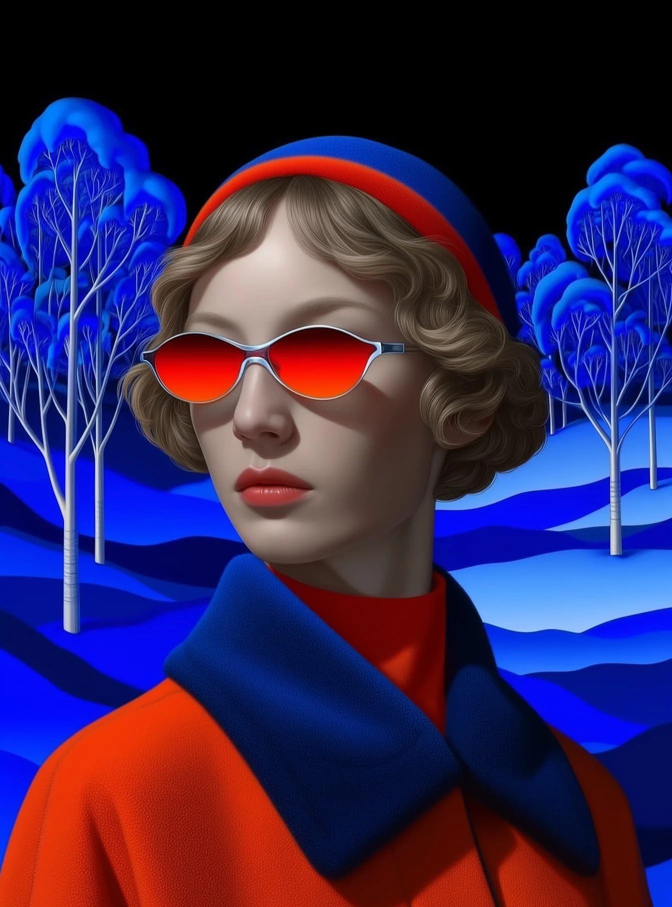
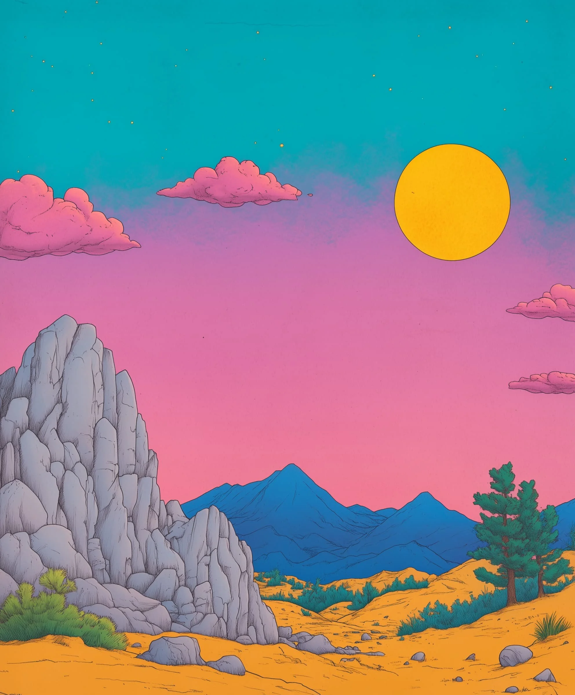
Surreal Illustration
In 2026, expect to see more of this kind of imagery woven into web design, hero images and illustration that have one foot in the past and one in the present. In some ways they borrow from a 60’s aesthetic and lean analogue, but they are undeniably futuristic in their saturation and style choices. This is another example highlighting the tension of people finding their footing as the speed of technology intensifies.
Blogs Aren't Dying. But The Bad Ones Are.
The keyword-stuffed article that exists purely to rank can, will, and frankly should disappear. It was never really for people anyway.
And yes, while everyone is complaining about AI slop, there are still people out there who genuinely love to stumble across a beautifully designed, carefully written blog post. These are the curators who are genuinely hungry for an alternative. These people are your audience, and a distribution channel.
This is where Malcolm Gladwell's Hush Puppies story becomes unexpectedly relevant. In The Tipping Point, Malcolm Gladwell traces how a nearly dead shoe brand was rescued not by marketing but by a handful of people in downtown Manhattan who started wearing old, unfashionable Hush Puppies. The brand had no idea it was happening. They were selling fewer than 30,000 pairs a year and had been considering discontinuing the brand entirely, when a handful of downtown Manhattan hipsters started wearing them around and a few designers took notice. Sales jumped to 430,000 pairs the following year, and four times that the year after. The brand didn't tip because of an ad campaign. It tipped because the right people found it, genuinely loved it, and their enthusiasm was contagious in a way that paid promotion can't beat.
Great blog content works the same way. Yes you need to be mindful of the algorithm and SEO best practices, but you're writing for the person who finds it, feels something, and passes it along. That person has disproportionate influence, not because they have a huge following, but because their taste is trusted by the people around them. When they share something, it lands differently than a sponsored post ever could.
The Takeaway
We're all navigating the overwhelm in our own way right now and it is showing up around us. These aren't just quirky lifestyle trends. They're signals of a culture figuring out what it actually wants from its time and attention.
Design, and the content it frames, is just one more place where that shift is happening. And in 2026, the work that resonates will be the work that understands what's underneath all of it. The desire to feel something real. To encounter something made with genuine care and to be met rather than targeted as part of an ad campaign.
As a Squarespace designer, I'm constantly exploring innovative approaches to web design and effective visual communication. Thanks so much for taking the time to scroll though and stay tuned for more blog posts!