Design inspiration: Fall edition 🎃🍂☔
Thanks for stopping by! Looking for something more recent - check out my 2026 web design trends article.
I saw a tweet the other day that read, “the ten best times of year”, and proceeded to list one through ten, as “fall.” Quite frankly, I wholeheartedly agree. If that makes me basic, so be it. I am all here for pumpkin anything and everything, an autumnal colour palette, and rain, rain and more rain.
As a Squarespace designer, I’m constantly stumbling on work from amazingly talented folks across various industries and this month, I’m excited to share Fall focused design inspiration from amazingly talented folks across the internet.
With that said, let’s dive into my monthly round up of design and marketing inspiration - fall edition.
1) Graza
2) Nonny Beer
3) Praise Endurance
Looking for more web design inspiration - check out the top web design trends for 2025 here.
Design Inspiration 1: Colour palette, illustrations and huge footer from Graza.
1. Colour palette
First up, we have Graza, an olive oil company out of Spain. I stumbled across this site, and I’m so glad I did. It does an incredible job at a few key design elements, namely colour palette, illustrations, and footer.


First and foremost, I fell in love with the colour palette. It is grounded, inviting, modern and playful. Earth tones have been huge this year, and for good reason. Designers are clued into consumers increased concern for the environment, and our universal desire to find some calm after a hectic few years.
This colour palette is a brilliant choice by Graza as it resonates with their key demographic - environmentally conscious, younger consumers. Not only have they been able to tap into grounding, comforting and calming vibes with the beige and green shades, but they have also created an eye catching and modern design by adding brighter, contrasting colours.
In fact, it just so happens that Gen Z loves green and they are a big fan of contrasting colours. It would appear green is to Gen Z, as Pink is to millennials.
As stated by nsgclub.com:
“If there is a color capable of representing the values and culture of the Zeta Generation it is definitely green. Immediately associated with concerns about the environmental condition, the digital evolution and the hopes of a better future after the pandemic.”
Given Graza’s TikTok account, we can assume winning over a younger audience is a big part of their marketing strategy. Focusing on this channel is s a smart move as Tiktok is becoming the preferred search engine for Gen Z.

For many years now we have become accustomed to seeing clean, minimalistic, and polished colour palettes, making these warmer, softer, and more organic colours a great way to introduce a new overall vibe and aesthetic.
If you are looking lo learn more about colour theory and psychology, this guide from State of Sage is well worth checking out.
2. Illustrations
Speaking of a move away from hyper polished design, Graza has also done a great job of incorporating illustrations. Not only are they charming, they are also used cleverly to communicate what could otherwise be some boring, albeit important information. Rather than bogging people down in a sea of text, Graza uses illustrations and leans into scrollytelling to demonstrate their features.
Increasingly, we are seeing brands move away from the obvious when it comes to illustrations, as it is a great way to add personality personality and effectively tell a brand story.


More often than not, olive oil falls into that category of something a bit more polished or refined and can lend itself to the pretentiousness that comes along with a “luxury” product. Graza manages to cut right through that narrative and stand out with their playful and quirky illustrations.
3. Huge Font Footer
Similar to the minimalist, polished aesthetic we have grown to know so well, website footers have remained rather uniform and uninspired for years now. Just as Graza has embraced adding their own spin to a rather traditional industry, they have applied the same to their website layout. Not only is Graza utilizing a vibey retro oversized font that we are seeing a lot of this year, but they are using it in an unconventional way - applied to their footer.

Source: graza.co
Is this trend here to stay? I don’t know, but I love it. While that may not seem like a huge deal, it is great to see brands rethink and reframe common website element and expand our concept of how they can be used in the future. Graza has proven the footer can be a source of design inspiration.
From their soothing yet cutting edge colour palette, playful illustrations, oversized fonts, and squeeze bottle packaging, Graza is shaking up the olive oil industry, and doing so successfully. So much so that Graza sold out within the first 24 hours of launching. Good work, Graza.
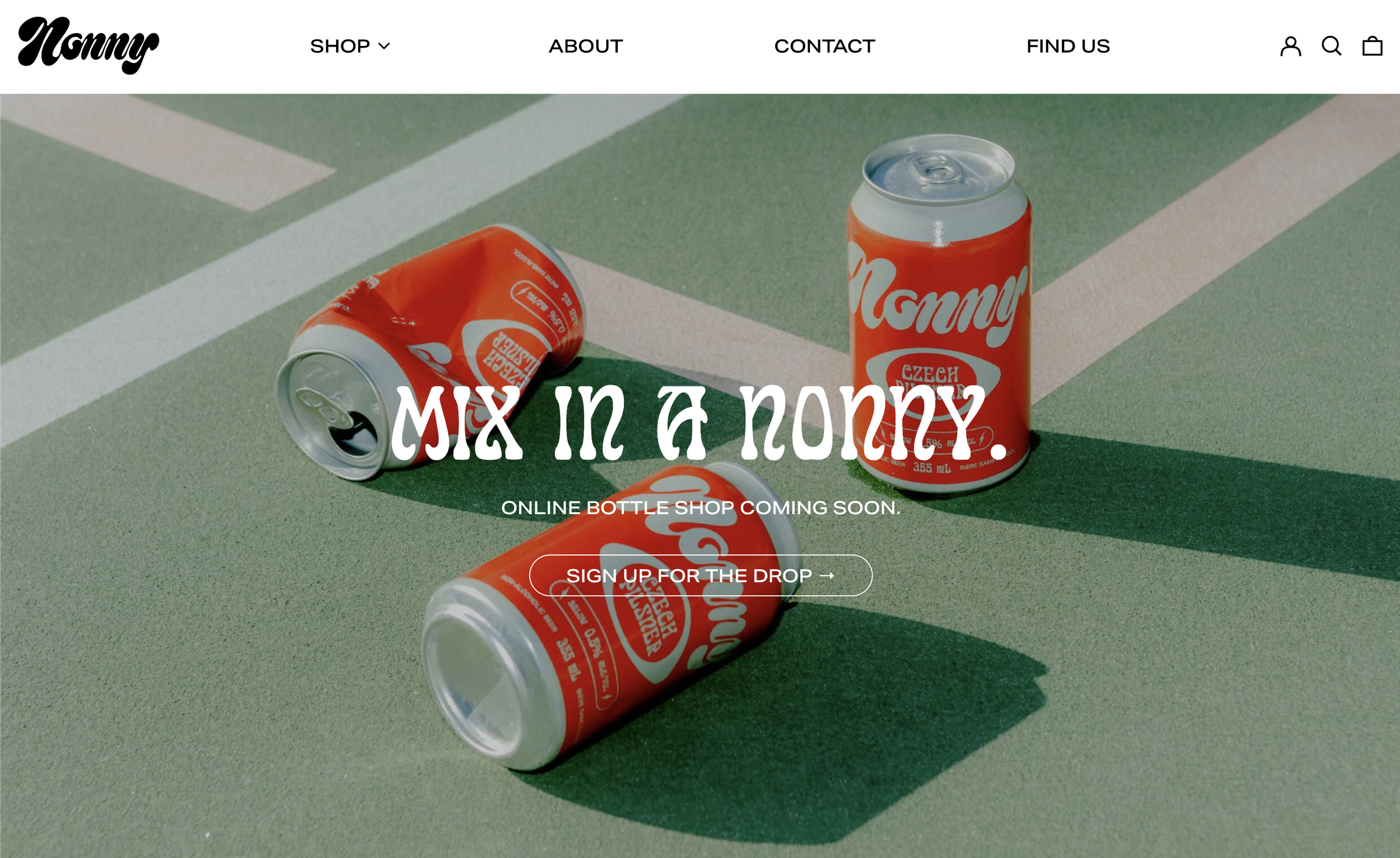
Design Inspiration 2: Photography, and product pages from Nonny Beer
Nonny is a company offering up non alcoholic craft beers. Before we dig into what I love about their website, it should be noted that the idea of hip, delicious non alcoholic beers and spirits is a design inspiration in-itself. Before I can go into singing Nonny’s praises I have to mention how inspiring it is that a non profit campaign was able to contribute so heavily to real behaviour change and help launch a hugely growing demand for non alcoholic beverages.
Many people around the world subscribe to Sober October - a one month challenge and opportunity to limit alcohol consumption, change habits, and raise funds for a nonprofit organization. Wildly popular, Sober October was started as a fundraising effort in 2014 by MacMillian Cancer Support.

In the years since the campaigned launched, A LOT has changed in terms of the non alcoholic beer market. Nowadays, many Gen Z’s and millennials are opting not to drink or to drink very mindfully. And with that behaviour change, some amazing new companies such as Kin Euphorics, Partake, Libra, and Athletic Brewing (and many more) have appeared.
And, these drinks are COOL. They are delicious, the websites are stunning, the social media is on point, and the packaging has the same attention, artistry and care that we have come to love from traditional craft beer.
What’s more, this isn’t just a trend. The non alcoholic beer category creating huge amounts of money and is one to watch.
Now that we have that covered, let’s dive into Nonny Brewing.
1. Photography
There is no denying it, the photography on the Nonny website is beautiful. The thing I love most about this photography is its retro feel. As I mentioned in my 2022 web design trends and predictions article, we are seeing a growing trend toward a film photography aesthetic. After years of extremely polished and perfected photos showing up everywhere from websites to instagram feeds, there is a growing trend towards photos with hues that look like they came from a 35 mm camera.
As an article from AIGA eye on design points out:
“A return to whimsy, and to its messily ornate aesthetic is, in some ways, a reckoning with the late-2010s hollowness.”
This is a trend we are seeing in web design at large. Photography, fonts, layouts and colours are all skewing more organic, and expressive, showing up in stark contrast to the heavily polished and minimalist aesthetic we have grown to know all too well.
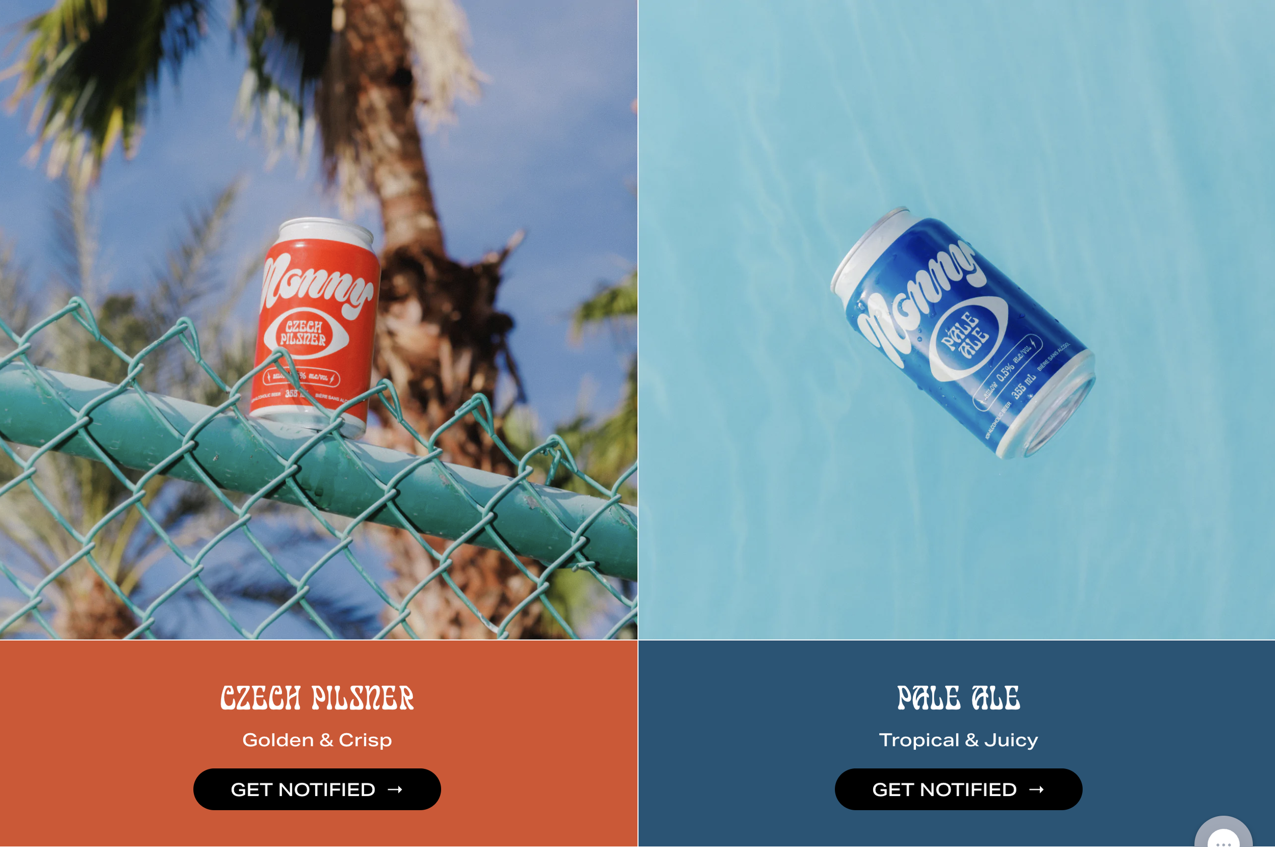
2. Product Pages
The product pages on the Nonny website are stunning. They look unique, while also being extremely organized and user friendly. Much like Graza has helped reimagine what a footer can be, Nonny has offered up a product page that is familiar enough to make it easy to navigate, but novel enough to be memorable.


Nonny has done a great job of visually organizing their products. As you can see, the hues in the photography mirror the colours of the cans. Rather than sticking to a typical white product page, Nonny has introduced the can colour for internal product pages. I personally love this look, and from a practical stand point it also works really well. It is always very clear to customers that they are on the intended page for a particular product and this formula will continue to work if Nonny adds additional products in the future.
Another design trend that is a lot of fun, is the use of lines. As Webflow’s article, 2022 inspiring web design trends points out, lines are a great way to “delineate sections, headers, paragraphs.” The lines lend to the retro vibe captured in their photography and font, while also being applied in a fresh and novel way.
Another great element Nonny has used is the accordion. Accordions are showing up everywhere these days, and for good reason. They look great and are a fantastic way to organize a lot of information. They also allow people to find the information that is important to them without being bogged down with a ton of content that may not be relevant to an individual customer. This is especially true on mobile, where lengthy content can be overwhelming and leave people frustrated.
Design Inspiration 3: Fluid and organic shapes from Praise Endurance
I love a fall trail run, and consequently while searching for gear, Praise Endurance has come to my attention. Praise Endurance is an apparel company specializing in running gear out of Montreal. Praise Endurance is another great example of a brand that is ditching clean lines for something more unique, and imperfect.
Opting not to use clean lines and a polished grid, Praise has gone for organic fluid shapes cascading down their entire homepage. This vibe works really well for Praise. When you land on their website, you feel more like you are landing on something special, with limited drops and a new vision of what athleisure could be.
Additionally the fluidity of the shapes lend well to a brand that’s products are often used outdoors and in nature. These fluid and organic shapes will continue to grow in popularity with our growing emphasis on sustainability.

Source: Praise Endurance
Rather than trying to fit in with big, well known athleisure brands that we have seen so many versions of, Praise is offering a a fresh perspective reflected across their marketing properties from social to their website.
From cooking to non alcoholic beers and trail runs, this concludes my edition of Design Inspiration: Fall Edition. In my opinion, this is a really exciting time for web design. As an industry, we have learned a lot of best practices, and that is a positive. However, things don’t feel so prescriptive anymore. We are seeing a lot more personality, and flexibility. What I love most is the creativity and problem solving that comes with delivering something fresh and new without sacrificing user experience. As we approach the last quarter of 2022, I look forward to seeing how designers are rethinking and reframing web design and looking forward to seeing your Squarespace websites in the near future.
Wishing you a very happy fall season.
Related Web Design Inspiration Articles