Web design trends and predictions to inspire your Squarespace websites
As people pursue their passions and set out on their own entrepreneurial journeys, they are sharing their vision, personalities and hopes for the future and this is influencing what we are seeing in web design.
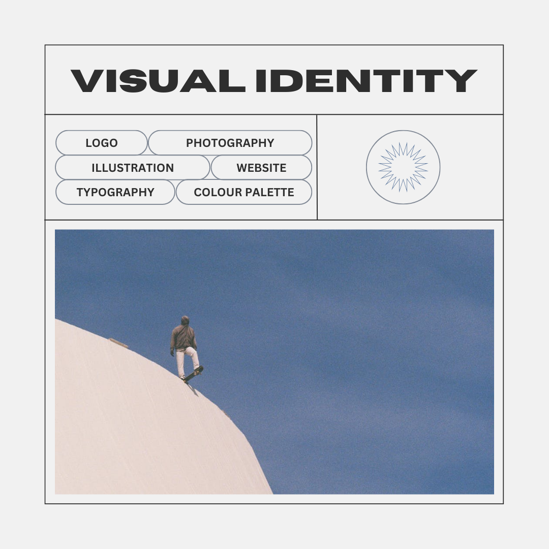
While the following article doesn’t cover designs that are uniquely built on Squarespace, I’m covering them to help inspire people as they move forward with their own websites. With the release of Fluid Engine from Squarespace, designers have access to whole new advanced drag and drop editor and smart gird, offering up more creative freedom and greater control over layout and positioning of elements, scaling fonts, and more.
As a Squarespace designer I’m continually inspired by the amazingly talented folks creating beautiful designs across industries. With that said, let’s dive into my web design predictions (and hopes) for the future of web design.
1. Quirky, colourful and hopeful
As I mentioned earlier, it has been a rough few years, and people are looking to inject optimism, hope and their unique point of view into web design. Accordingly, I think we will see a move towards playful and organic shapes and quirky characters paired with inviting copy.


Source: Circa Website Builder
The example above is from Circa, a website builder that has yet to be released just yet, but safe to say I am quite excited to work with it once it launches. Technically, Circa is another Saas (Software as a Service) product, but there is no corporate memphis illustrations to be seen here. The colours are bold, the copy tone is informal and inviting, and the creative assets are really quirky. The thing that stands out to me most about this website (circa.so) is that the landing page itself is really well done - the storytelling is strong, the CTAs (calls to action) are excellent, and it provides an excellent user experience. In my opinion, they have nailed best practices for what makes a website easy to interact with while also pushing the boundaries of creativity.


I love the example above from Ready, a Saas company offering a calendar. Again, they have taken a seemingly boring product and made me curious. The second image is especially exciting for me because they have done a fantastic job of clearly defining their value proposition without the jargon or fluff. What could have easily been dry or technical copy, instead is an excellent example of scrollytelling. Speaking of scrollytelling, let’s dive into that.
2. Scrollytelling
So what exactly is scrollytelling. It is really thinking differently about how you display your content and presenting it in a more engaging way. Scrolling can be a drag, scrollytelling strives to make it more magical.
I think scrollytelling can be very effective in taking rather dry content and holding someone’s attention. In my opinion, scrollytelling is amazing when done right, and frustrating when done poorly. Let’s take a look at an example of scrollytelling done right.

There is no denying that the example above does an excellent job of long-form storytelling. The website is beautiful and the interactions are done brilliantly. If this was a stand-alone website, I would personally find this amount of scrolling too much. However, it is important to note here, that the website where you’d make a purchase is EarthShoes, and they have added an opportunity on their website to learn more, which takes you to this longer scrollytelling experience.

With the emergence of a cookieless web, I anticipate we will see more experiences like this. While there will be a website with the goal of purchase, or conversion, I think we will see a lot of secondary ecosystems cropping up to tell a story, share values, and emotionally resonate and connect with people.
Scrollytelling for education, research and fundraising campaigns
In my experience, scrollytelling is a great way to take longer from educational or research-based content and turn it into something engaging. For many industries, their product or service may be a bit complicated, or confusing and scrollytelling offers a solution to keep people interested and gain a deeper understanding. Fundraising campaigns can also greatly benefit from scrollytelling as people often need to learn about a cause and feel invested before they are ready to take action.

The site above for the Urban Village Project is introducing a concept for sustainable living. Because potential customers may not be familiar with their plans for neighbourhood and home planning, there is a heavy education component. This website is a great example of how scrollytelling can be used as part of a larger content strategy to help move people from awareness to consideration.
3. Diversity and Inclusion
Diversity and inclusion in web design isn’t a trend or a prediction - in 2022 there is no excuse to fail when it comes to representation. It is about time people see themselves fully represented in web design. For representation done right, Adidas sets a great example with their new campaign for sports bras.

I was thrilled to stumble across the Website for Ok Mikah (below) and encourage everyone building a new website to understand the importance of inclusive design. If you can’t find stock pictures, search harder. If you can’t find graphics, search harder. It is entirely worth the effort to create better websites.

If you aren’t in a position to hire out creatives, there are a bunch of free design resources out there. Blush is one such source for amazing illustrations and talented artists.

Gender-inclusive language
Adding pronouns to the team section or about me section of your website is a great place to start. Check out Argo Collective to see this in action.
Additionally, if you have a form requiring gender (is this really required?), make sure people can input what is correct for them - do not limit them to male/female. Also, a person’s legal name may not be their preferred name - this is something you’ll want to be mindful of. You don’t want to deadname someone when you reach out in a follow-up email.

A big part of getting this right is starting with user personas that take gender inclusivity into account and empathize with how people will move through and interact with your website and marketing materials.

I was so happy to see Mejuri using gender-inclusive language and stating pronouns in the example above.
It’s time to move away from gendered copy- goodbye “boyfriend fit.”
You don’t want to assume someone’s gender identity or sexuality, and it’s important to be mindful of that in your copy. For example, it is time to do away with describing clothing as “boyfriend fit.” In 2022, we can do away with language that is tied to the patriarchy and attempts to make a piece of comfortable clothing less “threatening” and more“cute” by describing it as “boyfriend fit.”
This is a great place to share a quote Shani Silver wrote stating:
“Claim comfortable clothes. Claim the structure you like, the fit you like, whatever it is that you like, it’s yours. You haven’t “borrowed” it from anyone, that was always an industry’s slight-of-hand to reiterate the vital necessity of maintaining femininity at all times.”
You can read their full article here.
As an example, according to a 2022 Gallup poll, 1 in 5 Gen Z U.S. adults identify as LGBTQ+. What does this mean for web design? People want to see themselves seen and represented in marketing and design. If for example you’re a realtor, or any service provider for that matter, consider your visuals - are you assuming all of your clients are heterosexual? Good design is inclusive design.
4. Organic and imperfect print style illustration
I think we will see more illustrations and graphics that borrow from print and deliver an aesthetic that mirrors this style showing up in web design in 2022 and beyond. In some cases, I think this style will be in opposition to the glossier 3D elements that are so popular now, but I also think we will see these elements in concert with some of those more polished elements. Look for vivid colours, pixelation and imperfections.


Non-profit Family Meal, featured above delivers amazing graphics from brilliant illustrators and designers throughout their website.

Absurd.design featured above is a great example of imperfect and hand-sketched illustrations and even offers some for free - visit their website here.
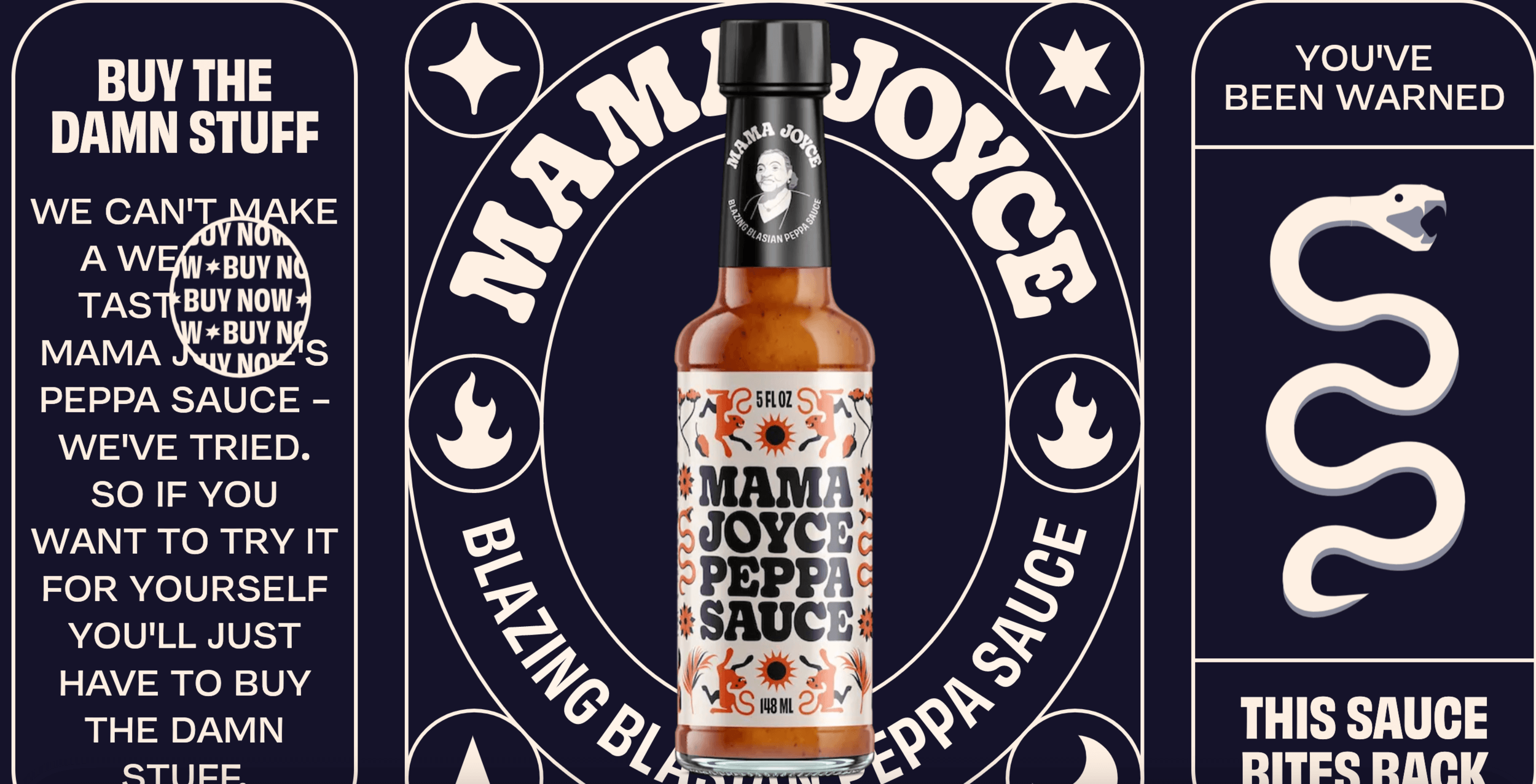
5. Retro fonts
Recently I have seen a lot of throwback elements to the 70s with a modern even futuristic delivery. In this example from Mama Joyce, we see a bold 70’s font choice, with graphics that feel both nostalgic and current at the same time. If you take a moment to visit the website, you will notice, the website is anything but retro and delivers the kind of experience you’d expect to see from top designers in 2022. Scroll to see a few more examples of retro-style fonts. Another common application I see is 70’s style retro fonts paired with glossy and polished 3D elements.


6. Web 3.0
The best way I can describe this next style is a mix-up between psychedelic ’60s meets y2k meets the Matrix. Elements of this aesthetic seem to be popping up everywhere and feel like part of a larger trend towards Web3, cryptocurrencies, NFTs and new technologies. I think we will continue to see a mashup of gradients and fonts that borrow from the past but feel completely futuristic. Building on that, I think we will continue to see more 3D and iridescent shapes emerging along with throwback pixelated elements.
This great article from Shopify outlines how NFTs can be used to foster brand loyalty. It is well worth the read and digs into the future of eCommerce and Web3.


The example for Latercon, a conference put on by Later, below is a good example of the Y2k aesthetic paired with a futuristic application that I think we will continue to see more of, especially in spaces that are technology-based and cater to Gen Z. To dig deeper into these trends, visit this article from Creative Boom.


Digital technology is growing at a rapid rate and that will continue to come through in design trends and influence the way online communities (hello TikTok, goodbye Instagram) are built and the marketing that follows. More recently we are seeing how marketers are exploring NFTs. According to Vogue Business, an NFT from Gucci, called Gucci Grail is releasing later this month. Further, Gucci is launching an experience for Gen Z in the Metaverse.
7. Accordions everywhere
The accordion is a great design element when used well. It works well for FAQs and can really clean up a page that is overwhelmed with text. Accordingly, it can also improve a mobile experience by saving someone from endless scrolling. Worth noting, an accordion shouldn’t hurt your SEO. Google is focused on a positive mobile user experience, and seeing as accordions can provide that, it looks like Google is able to read tabbed content. You can read more about the evolution of tabbed content and SEO here.

The example above is from sealco.ca, an accounting firm. In my opinion, this is an excellent use of an accordion. I think we will see more service-based businesses that tend to be very text-heavy use this design element. Not only does it create a much better user experience on mobile (and desktop) it also allows for a much cleaner and modern web design style that you don’t always expect from professional service-based businesses. Their website is a breath of fresh air, and a great example of a new take on minimalistic design - go ahead and check it out.

The example above is a nice application of an accordion for a solopreneur using the Squarespace 7.1 platform. Here the accordion is kept above the fold and gives you a very quick idea of this professional’s approach.

One final example of the accordion is from my own website, used in a more traditional sense - an FAQ. The accordion allowed me to answer questions I am always asked in consultations. Not only is this a great way to provide a lot of content in a limited amount of space, but it also improves the quality of leads. When people have better clarity about your business services, clients who are more interested in moving forward with projects are likely to reach out.
8. One page websites
As the great resignation surges and more people start their entrepreneurial journeys, they are learning they definitely need a web presence, but while they refine and iterate on their product and service offerings, what they need is a landing page or one-page website they can expand on. I think we will see a lot of one-page websites that help people launch their businesses as they become soloprenuers. We will also see a number of long-time small business owners who have relied on word of mouth come to appreciate the importance of having a website to build trust and educate people about their services.


The site above from E. Stewart and Associates is a beautiful example of a single-page website that has done a great job of using scrolling gallery blocks to showcase a lot of information but keep all the essential material on one page. This is an industry that I wouldn’t expect to have such a stunning website and is an example of how business owners can stand out and gain trust with their web design.


Above features Stupak.com, a freelance illustrator and designer. This one-page website offers a great example of a single-page website with a narrow focus, offering up only the most important information, and providing a clear call to action. It’s important to note, this website is simple, but it’s memorable - choosing simplicity doesn’t mean sacrificing personality.
9. A nice looking website won’t be enough
According to Siteefy, 175 new websites are published every minute. As website builders (like Squarespace, Wix, Webflow, WordPress, Shopify) and the like improve and the technology advances, the limits to what designers and non-designers alike can create are constantly changing.
Today, you can build an exciting website, that doesn’t take months and months, and you aren’t bound to one template or aesthetic. This is all great news!
However, it will mean more competition.
The truth is, a nice-looking website isn’t enough. Building a successful business will mean having a thorough understanding of conversion-focused web design, effectively communicating your value, creating a website structure that supports marketing activities (landing pages), and developing strategies and tactics for growing your business in both the short and long term.
10. Film photography & unique artistic style
The iPhone turned everyone into a photographer. In 2022, think we will see a resurgence to film photography or at least the feel of it. Here I don't mean putting filters on everything, but more so, seeing the unique world view of the photographer through their pictures. Being able to see a photo and recognize it is someone's work. One look at
Aime Leon Dore and all of the photography has an aesthetic as though its shot on 35mm film.

As we ponder fast fashion and consumerism, I think we will see big brands adopt photography with a unique perspective and a desire to demonstrate that their products are here to outlast a single season. That isn’t to say it will all be about nostalgia. I think we will see a lot of mixed vibes happening. For example, expect to see modern fonts and graphics, paired with film photography.
AIGA - Eye on Design recently released a great article on the film photography aesthetic popping up everywhere, and digs into the larger trend of “indie sleeze,” making reference to hashtags on TikTok like “filmtok.” To learn more about the resurgance of filtered film photography, visit this article.
Conclusion: It’s an exciting time for web design
In my opinion, this is a really exciting time for web design. As an industry, we have learned a lot of best practices, and that is a positive. Moreover, things don’t feel so prescriptive anymore. Your website doesn’t have to look ONE way to look “professional” or be deemed good, or cool or whatever accolade resonates with you. There is more flexibility and people are pushing boundaries. Most importantly, people are also focusing on people. Designers are focused on delivering a good user experience while also letting unique points of view and personalities shine through.
I hope this offered some inspiration for your own Squarespace designs and I look forward to seeing more dynamic and compelling Squarespace websites in 2023.
Looking for more web design inspiration, check out my article for web design trends 2025 here.
Happy web designing!
Related Web Design Inspiration Articles