Crafting a Compelling Visual Identity for Your Squarespace Website
In the vast and competitive digital landscape, standing out from the crowd is more important than ever. One way to achieve this is by understanding and harnessing the power of visual identity. So, what exactly is visual identity, and why is it a key component to your Squarespace website? Let's dive in and discover the answers.
What is Visual Identity?
Visual identity encompasses the visual elements that represent and communicate the essence of your brand or business. It goes beyond just having a logo; it includes the colours, typography, imagery, and overall design aesthetic that is associated with your brand. Visual identity is the visual language through which your brand communicates its personality, values, and unique selling proposition. 🌈🎯
The Key Components of Visual Identity
Logo and Brand Mark:
A well-designed logo instantly communicates your brand's identity and serves as the visual representation of your business. A compelling brand mark creates a lasting impression and acts as a memorable symbol that distinguishes your brand from others.
Work with a professional designer or use design tools to create a logo that aligns with your brand values and resonates with your target audience. Ensure that the logo is versatile in different sizes and formats to maintain its impact across various digital platforms.
Best Practices for Creating a Timeless Logo:
Keep it Simple: Avoid excessive detail and intricacy, as these elements can quickly become outdated. Aim for a minimalistic design that captures the essence of your brand.
Prioritize Flexibility: Consider the versatile applications of your logo across different mediums and platforms. Ensure it looks compelling and legible when scaled down for mobile devices or other small formats.
Opt for a Timeless Typeface: Choose a font that is clean, legible, and free from trendy or overly decorative styles. Classic typefaces tend to endure longer and retain a sense of timelessness.
Limit Color Palette: Restrict the number of colours in your logo to create a sense of simplicity and timelessness. Aim for a combination that is visually appealing, well-balanced, and retains its impact even in monochromatic or limited color situations.
Consider Scalability: Ensure that your logo design can be scaled up or down without sacrificing legibility or losing important details. Test your logo at various sizes to ensure it retains its impact across different applications.
Colour Palette:
Colours evoke emotions, set moods, and create visual associations. A carefully chosen color palette that aligns with your brand values and essence can convey a specific message to your audience, leaving a lasting impact.
I fell in love with the colour palette from Graza. It is grounded, inviting, modern and playful. Earth tones have been huge this year, and for good reason. Designers are clued into consumers increased concern for the environment, and our universal desire to find some calm after a hectic few years.
This colour palette is a brilliant choice by Graza as it resonates with their key demographic - environmentally conscious, younger consumers. Not only have they been able to tap into grounding, comforting and calming vibes with the beige and green shades, but they have also created an eye catching and modern design by adding brighter, contrasting colours.
Squarespace stands out among other web design platforms with its seamlessly integrated feature of built-in colour palettes, empowering users to effortlessly explore and implement stunning colour schemes that elevate the aesthetics of their websites.
Coolors.co is another great option for finding colour palette inspiration.
Typography:
Fonts play an essential role in creating visual hierarchy and expressing your brand's personality. Whether it's a bold and modern typeface or a classic and elegant one, typography sets the tone and helps establish brand recognition.
Retro fonts have experienced a resurgence in popularity, giving websites a nostalgic and unique vibe. However, while experimenting with vintage typefaces can be appealing, it's important to select fonts that will withstand the passage of time and maintain legibility for a seamless user experience.
Several successful brands, such as Airbnb, Dropbox, and Slack, have effectively used nostalgic typography to capture the establish relatable and approachable brand identities.
Best practices for website typography include:
Opt for timeless fonts: Choose fonts that have a classic and timeless appeal, like serif or sans-serif typefaces, to ensure they remain relevant as design trends evolve.
Prioritize legibility: Ensure that the chosen font is easy to read at various sizes and on different devices, especially on mobile platforms. Avoid overly decorative or stylized fonts that may compromise legibility.
Contrast is key: Create a visual hierarchy by using contrast between font sizes, weights, and colours. This allows important information and headers to stand out and guides the user's attention.
Consistency is essential: Maintain consistency in font usage across the website to establish a cohesive and professional look. Limit the number of font families used to create a more unified visual experience.
Consider accessibility: Choose fonts that are accessible to all users, including those with visual impairments. Ensure that the font has sufficient contrast with the background and supports screen reader functionality.
When it comes to designing your website, Squarespace offers a remarkable assortment of elegant font pairings to elevate your brand's aesthetic. In addition, you have the freedom to either select from a wide range of preloaded fonts or unleash your creativity by uploading and using your own unique fonts.
Typewolf is a favourite source of mine for finding font inspiration and font pairings.
In this example from Mama Joyce, we see a bold 70’s font headings paired with modern subtext.
Imagery and Graphics:
High-quality and consistent imagery can shape how your audience perceives your brand. Whether it's through professional photography, illustrations, or graphic elements, visual imagery helps tell your brand's story and captivate your audience.
From playful doodles to claymation, organic shapes and sleek photography, the imagery and graphics used throughout your Squarespace website play a huge role in you will communicate who you are with your audience.
I love this example from milkjar.ca, a candle company that has expertly crafted a brand that exudes a warm, playful, and contemporary vibe. Their website showcases a wonderful blend of modern and delightful doodles, all strategically harmonized to create a cohesive and vibrant look. It's a brilliant demonstration of balancing modern aesthetics with a sense of fun and relaxation.
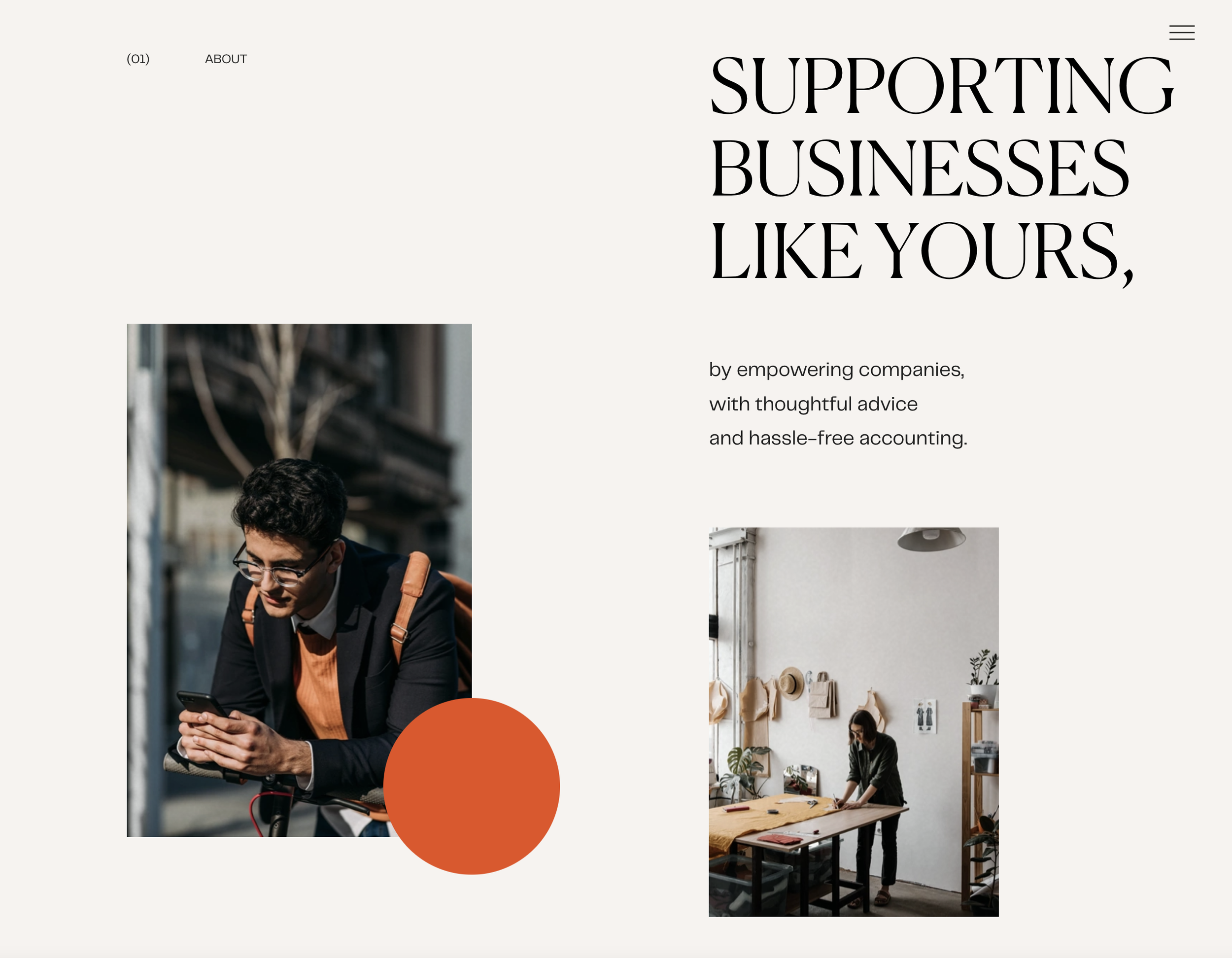
In stark contrast, but equally well done, Seal + Co offers up sleek minamilist branding, relying heavily on photography to create a one of a kind look and feel.
Layout and Design Elements:
The overall design aesthetic, including the placement of elements, spacing, and overall layout, contributes to the cohesiveness and professionalism of your website. Consistency in design elements ensures a seamless user experience and enhances brand recall.
Squarespace allows you to choose from our extensive collection of beautiful and customizable templates, or if you’re seeking more control over your designs, you can start from scratch and use Fluid Engine, the newest newest editor from Squarespace. With its flexible and intuitive interface, Fluid Engine allows you to create bespoke designs that truly stand out.
The Importance of Visual Identity in Your Squarespace Website
Brand Recognition:
A strong visual identity creates a distinctive brand presence that is recognizable and memorable. By consistently incorporating your visual identity elements throughout your Squarespace website, you establish a cohesive and professional brand image, making it easier for your audience to recognize and remember your brand.
Consistency and Trust:
A visually consistent and well-crafted website instills a sense of trust and credibility in your audience. When elements such as colours, typography, and imagery align with your brand's visual identity, your audience perceives your website as professional, reliable, and trustworthy.
Carrying your visual identity across all marketing platforms, including paid ads, is crucial for creating a cohesive experience. By maintaining consistent branding elements such as colours, fonts, and logos, you establish a visual connection that builds recognition and familiarity among your target audience. This consistency not only increases conversions by creating a seamless and trustworthy experience but also fosters a strong brand identity that leaves a lasting impression.
Differentiation:
In a crowded market, a unique and well-defined visual identity distinguishes your brand from competitors. It helps you carve out a space for yourself, attract the right audience, and create a memorable impression that sets you apart.
Enhanced User Experience:
Visual identity elements contribute to the overall user experience on your Squarespace website. Thoughtful design choices, such as clear typography, well-structured layouts, and visually pleasing imagery, create an intuitive and engaging experience for your visitors, encouraging them to stay longer and explore more.
Brand Alignment and Storytelling:
Visual identity elements act as a visual narrative, conveying your brand's personality, values, and story. Through careful design choices, you can visually communicate your brand's essence and establish an emotional connection with your audience.
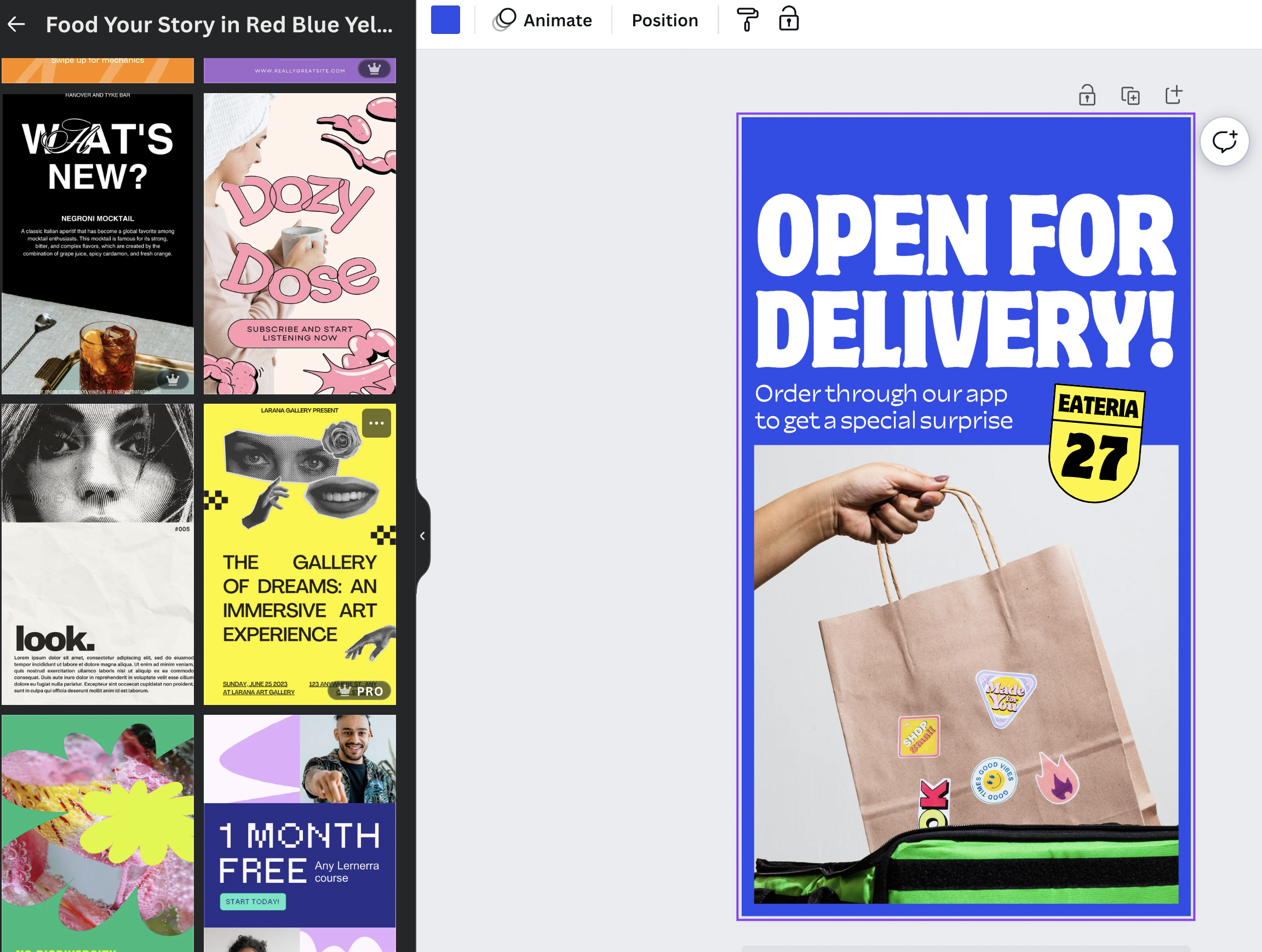
Creating a cohesive visual identity that carries across platforms is a key component of creating a strong online presence. With Canva, you can quickly and easily design stunning graphics, infographics and social media posts sized for different platforms. One of my favourite features of Canva is their library of templates, images, icons, and fonts that make it an excellent option for individuals and businesses looking to create visually appealing content across platforms.
Source: Canva.com
In conclusion, visual identity is a key component of your Squarespace website. It sets the stage for your brand, influences how your audience perceives you, and differentiates you from competitors. By crafting a cohesive and visually compelling visual identity, you create a strong foundation for your online presence, unlocking success and leaving a lasting impression on your visitors. 🚀✨


